Blog
Subscribe
Join over 5,000 people who receive the Anecdotally newsletter—and receive our free ebook Character Trumps Credentials.
Categories
- Anecdotes
- Business storytelling
- Collaboration
- Communication
- Corporate Storytelling
- Culture
- Decision-making
- Employee Engagement
- Events
- Fun
- Insight
- Leadership Posts
- News
- Podcast
- Selling
- Strategy
Archives
- April 2024
- March 2024
- December 2023
- November 2023
- October 2023
- September 2023
- August 2023
- July 2023
- June 2023
- May 2023
Years
Why you should avoid having text on your slides when you are talking
Last week I was working with a client in Sydney, preparing a senior leader to present a new strategy to their people using a strategy story.
We designed the presentation so that the strategy story could be told without slides. We wanted the leader to just talk with their employees about the strategy and why it was happening. But the story sat inside a bigger presentation, so there was a holding slide for where the story would be told, with the company logo emblazoned on a bright white background.

I suggested that the holding slide should be blank (all black) to focus the employees’ attention on the leader as they related the story. But I was told that this might confuse the audience, causing them to think the presentation had gone wrong.
Companies have gotten into bad habits using PowerPoint, wielding it in ways that detract from the objective of helping people to understand, remember and apply what they have learned.
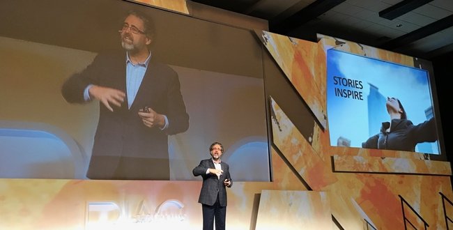
The rejection of my slide-blanking-suggestion was a minor transgression. A much bigger problem is when leaders want to use their slides as a teleprompter. Yes, this might make it easier for the presenter to remember what to say, but it makes it harder for the audience to understand and remember the content.
Researchers have known since at least the 1950s that humans are prone to cognitive overload. If there is too much stimuli from multiple sources, we get confused because we have relatively small working memories. Several major inputs will split our attention.
In 1999, researchers at the University of New South Wales published the results of a study into cognitive overload, specifically the situation where people are simultaneously talking and showing text and a diagram, just like a PowerPoint presentation.1 When participants were shown a diagram with text descriptions while listening to an audio explanation, they had to double the number of times they performed the exercise to understand it compared to just having the diagram and text.
Professor John Sweller later summarised the research by saying, “It is effective to speak to a diagram, because it presents information in a different form. But it is not effective to speak the same words that are written, because it is putting too much load on the mind and decreases your ability to understand what is being presented.” 2
So when using PowerPoint at work, show your diagrams and graphs and explain them orally. But don’t fill your slides with dot-points of text and then say the same things in different words, as if you are summarising what’s on the slide. This is a sure-fire way of ensuring that your audience walks away with nothing but disdain because you’ve wasted their time.
References
1. Kalyuga, Slava, et al. “Managing Split-Attention and Redundancy in Multimedia Instruction.” Applied Cognitive Psychology, vol. 13, 1999, pp. 351–371.
2. Patty, Anna. “Research Points Finger at PowerPoint.” The Sydney Morning Herald, 4 April 2007, www.smh.com.au/technology/research-points-the-finger-at-powerpoint-20070404-gdpu3u.html
About Shawn Callahan
Shawn, author of Putting Stories to Work, is one of the world's leading business storytelling consultants. He helps executive teams find and tell the story of their strategy. When he is not working on strategy communication, Shawn is helping leaders find and tell business stories to engage, to influence and to inspire. Shawn works with Global 1000 companies including Shell, IBM, SAP, Bayer, Microsoft & Danone. Connect with Shawn on:
Comments
Comments are closed.
I’m a big fan of telling stories without a slide “teleprompter” (and brilliantly put, by the way). I’m struggling more with the 2nd half of the piece which seems to talk generally about the use of text on slides.
Many of the decks I’ve been a part of building have to support two use cases: (1) live presentation and (2) offline reading for those who couldn’t attend the live presentation. The way I teach the management of these dual use cases–and I may be wrong–is to put the narrative arc of the presentation in the headlines and bottom-of-the-slide takeaways, with enough content (text or graphics) in the middle of the slide to succinctly communicate supporting points. The goal should be a slide which can be scanned and parsed in under 10 seconds, minimizing its distraction from the speaker while supporting the speaker’s delivery.
This also helps those attending the live presentation who learn visually rather than audibly. Finally, by having enough content to stand alone (without the presenter) it continues selling without the presenter in the room.
I’m curious if your view is that this has validity–or at least situational validity.