Visualising statistics
 I’ve always has an admiration for anyone who can display complex information simply. This is why Edward Tufte’s books, like Envisioning Information, are among my favourites.
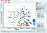
Nerida Hart sent me this link which I think you’ll find impressive: http://www.gapminder.org/
Nerida, when are you going to get a blog so I can link to this cool information you send me?
About Shawn Callahan
Shawn, author of Putting Stories to Work, is one of the world's leading business storytelling consultants. He helps executive teams find and tell the story of their strategy. When he is not working on strategy communication, Shawn is helping leaders find and tell business stories to engage, to influence and to inspire. Shawn works with Global 1000 companies including Shell, IBM, SAP, Bayer, Microsoft & Danone. Connect with Shawn on:
Comments
Comments are closed.
You really need to see Hans Rosling in action using this software, in the videocast from TED this year. Google his name and TED and be prepared to be blown away.
Great stuff Shawn
I wish I had time to write a blog, but it is much nicer to see it up on the Anecdote blog 😎
Nerida